@BABEL Creativa
Year
2017
Deliverables
- UX-UI Design
Adding functionalities to a banking app to make it fit to business users
When products reach to a maturity level, their features can be led to niche users. The discovery of new needs and opportunities for the mobile app helped to develop new tools oriented to a business user.
Challenges
Let’s give additional features to a banking environment without breaking the UX
Thinking
Approach
had recently released an app for their customers to organise payments, transfers and control their expenses and incomes, all on their own. But after several months of gathering information and learning from users, they decided to reinforce their personal banking division creating a new app.
For this project, the main goal was to manage several accounts in a really intuitive way, an agile and complete notification center and some advanced features related with unpaid operations and due payments.
To achieve a useful UX, the product owner suggested a dashboard approach. Notifications, main data, fast access to relevant info… All just on a single screen.
Planning
Problems
Business people care. They want their information on the fly. But what’s the main information?
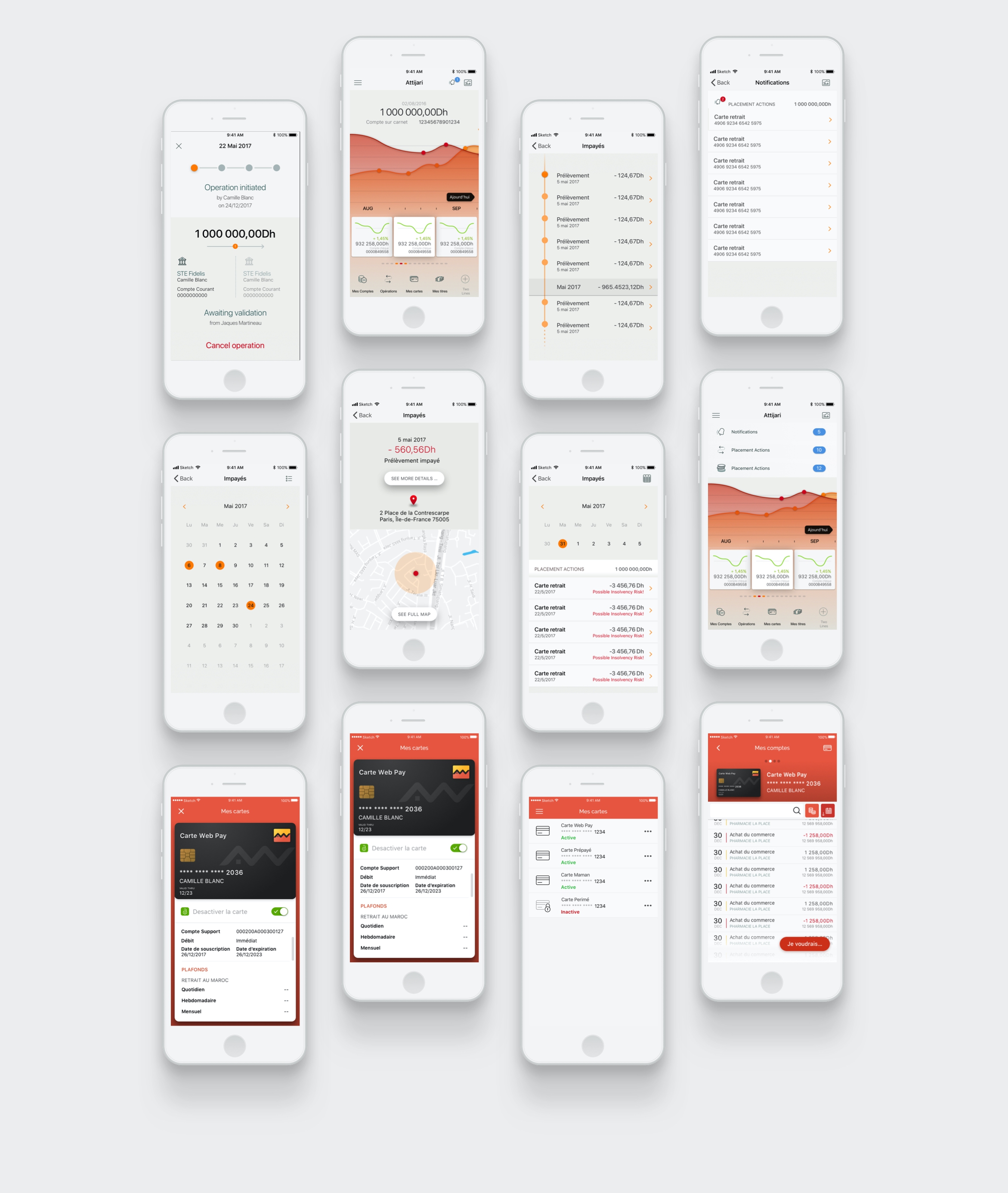
After some insight, we found two different sources of relevant information –from users interactions and from account changes. As accounts information isn’t released at real time, that was consider a one-time-useful information. If our user opens the app several times a day, they will probably find the same information related to their money.
But user interaction was more unpredictable and it turned to be lapsed in a few minutes. Besides, at some operations consisted in a validation interchange, notifications became extremely important. So we decided to set notifications in a visible spot over accounts information and navigation.
After that, we needed to make decisions over patterns. Data visualisation combined dates, amounts, details and actors. We proposed different solutions to each of them so that the user could recognise easily their purpose and a clear interaction.


Solving
Solutions
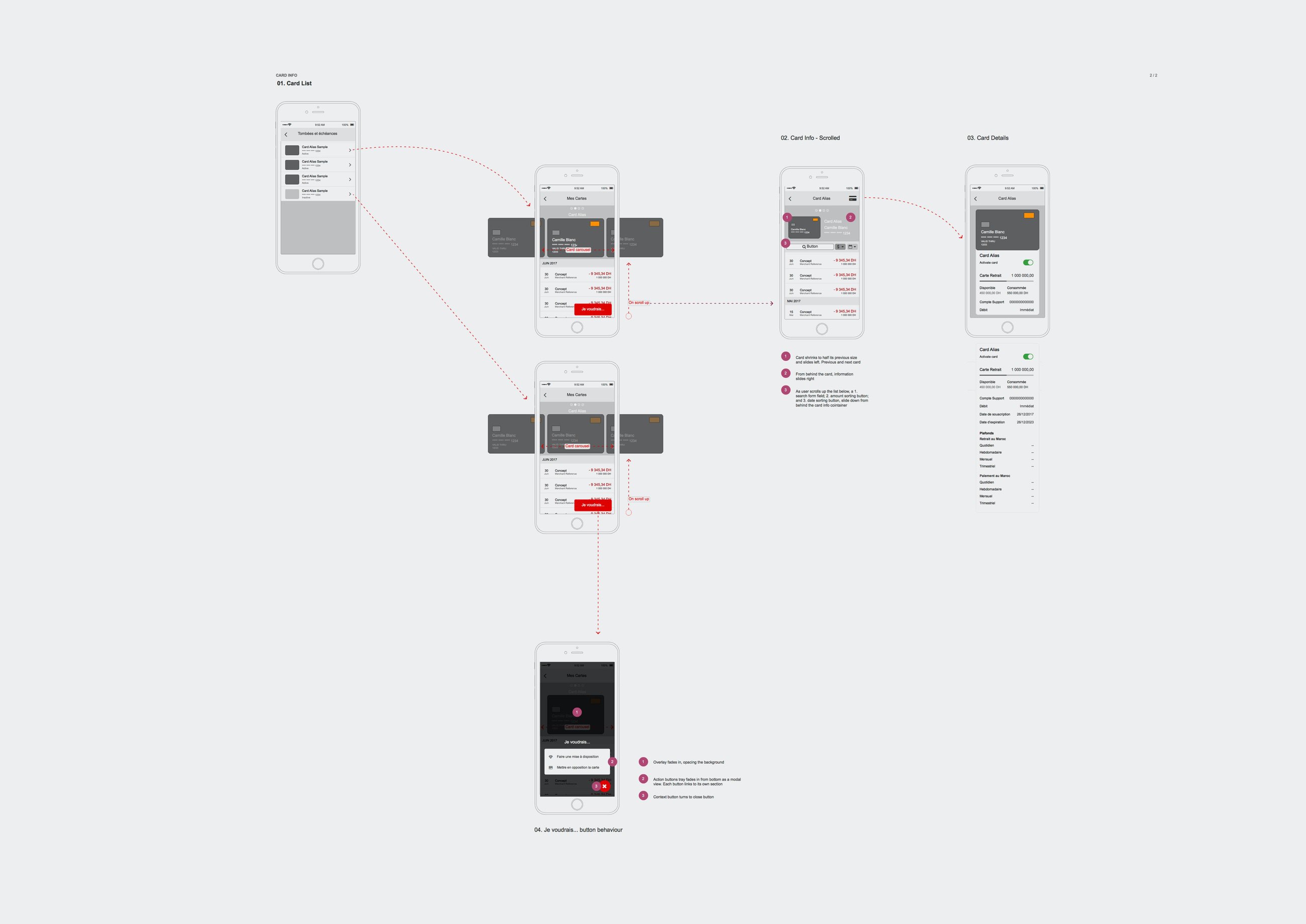
Variable information was set on top. This would clean the rest of the information in case of discarding the new messages. We struggled to work on a busy screen in order to figure out how it would look if the user had a lazy day. Notifications couldn’t be grouped on a more natural spot (at the navigation bar) because it was decided to set an undefined shortcut.
Patterns were selected after several thoughts. Due dates were naturally defined on a calendar –a familiar pattern for things to be made in future. It also provided the user a more intuitive and precise navigation gesture, and a understandable infinite scroll.
Unpaid were sorted on a timeline at which progresses were checked and understood, grouped by months and detailed as a plain account. Then details could be displayed to check them in a glance.
Besides, operation verifications were designed as a step-by-step progress. We needed to tell the user the actual operation stage, what was going next and if there was anything relying on them. At some point, this feature was to be connected to a personal messaging module to notify, inquire, ask or solve any concern about the operation with any related user. A tricky work at this section was to describe every single screen change depending on the operation status, that would imply cancelling or approving permissions asymmetrically.
Each section had its own design, but the overall was connected with a consistent design system, inherit from the original app, but widened and completed with the new requirements.


Creating
Performance
After deciding on the wireframes and design system, we worked on the UI and interaction. There were some key behaviours we needed to keep from the original customer’s app, such as color scheme (we provided two versions, light and dark, to differentiate both apps but finally the light one was chosen), patterns and data visualisation. But most of them didn’t fit our needs, so the UI was almost designed from scratch.
We set a design system based on the previuos look –as I received the project there wasn’t a proper design system at all– to work on patterns and components from the easiest ones (lists, buttons, forms) to the most complex ones (timelines and charts, specially). Little by little we completed the design environment with molecules and organisms, to finally describe the whole interactions.
Additionally we updated a card management module to the users’s app, so we needed to create new patterns and objects that could live in between in case they needed to be applied in future to the business app.
Delivering
Results
It wasn’t a tough project –actually it was piece of cake considering the complexity of bank operations. It was really exiting opening our minds to different perceptions of dealing with money, managing operations or solving them.
Finally we managed to arrange a lot of information in a visually ordered clear way for what we expect may be a powerful and helpful tool.


