Year
2015-16
Deliverables
- UX-UI Design
- Brand
- Product Design
Making payments easier, more secure and from anywhere right on your mobile phone
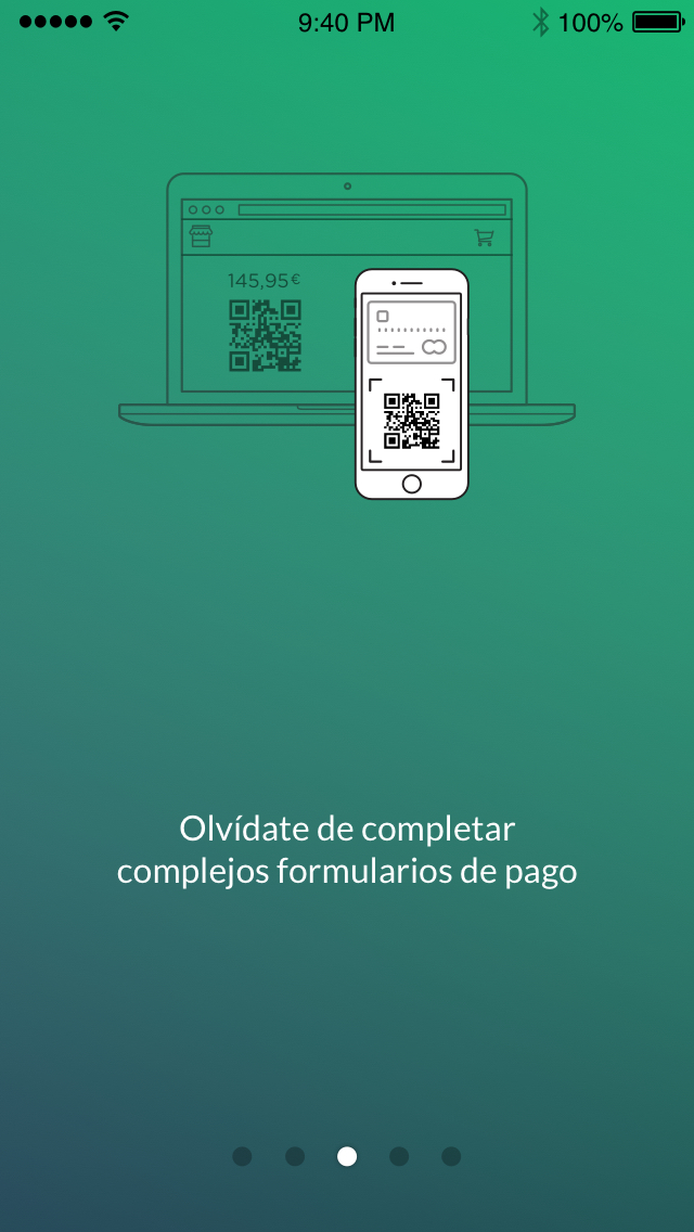
Nowadays anything can be done with a mobile phone. That’s why everything should be paid from that device. To make things easier to both customer and merchant, TECHNOactivity developed a revolutionary mobile payment method, years ahead from other companies. But it needed a user centred insight.
Challenges
Let’s say goodbye to cash and physical credit cards. No more ‘pay on your phone’. Just pay with your phone.
Thinking
Approach
MYMOID was the brand developed by TECHNOactivity to commercialise a payments service for mobile phones. The company had been pivoting to the original entrepreneurship to several solutions in order to generate s sufficient critical mass to reach the ROI set by the investment fund.
After that effort, the company owned an innovative payments system –years ahead from the rest of competitors. But they didn’t have a reliable product or a commercial strategy to make their product profitable in short terms.
After a deep insight and many changes, the opportunity was to associate as a payments services provider with Correos in a massive project that would involve a major joint venture.
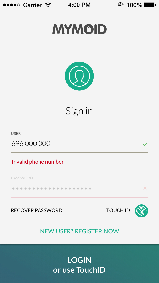
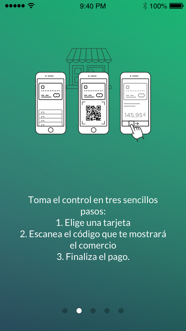
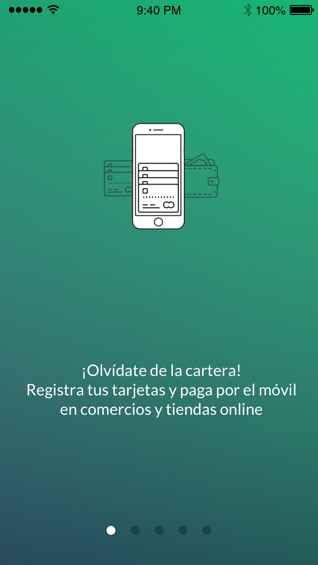
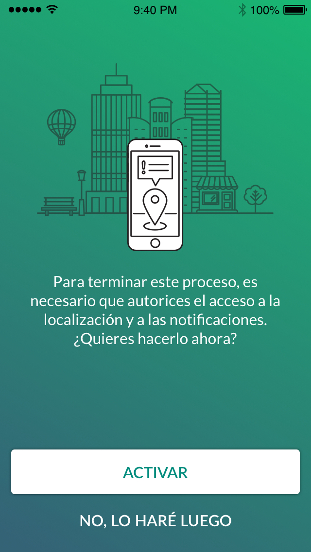
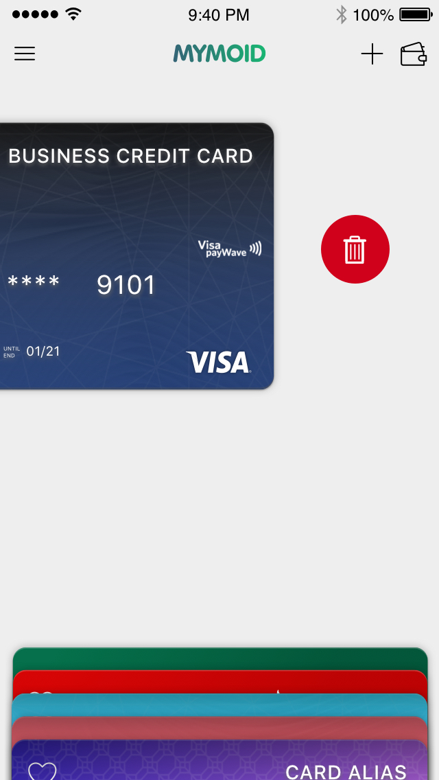
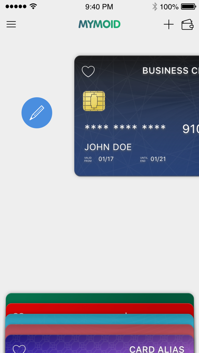
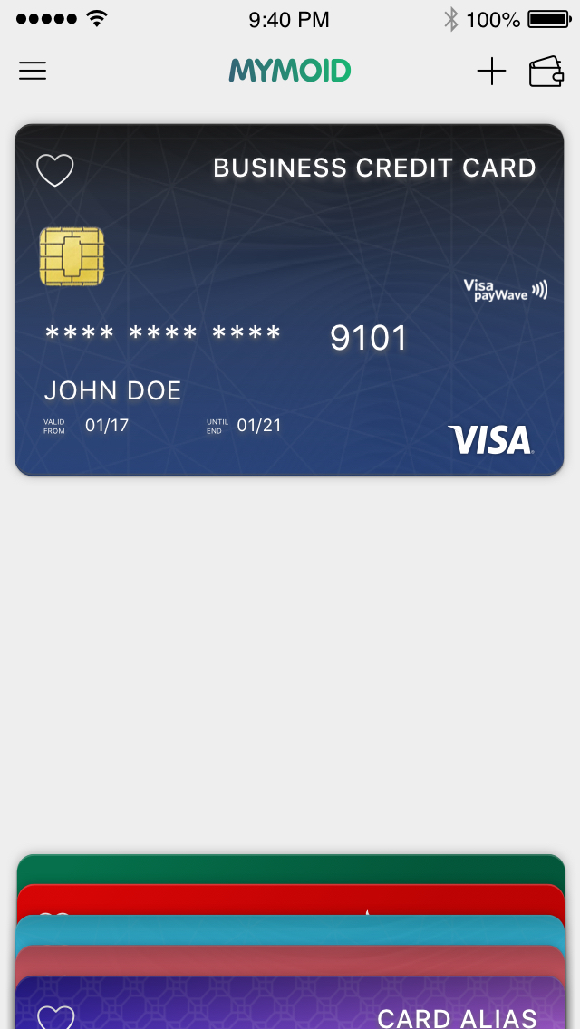
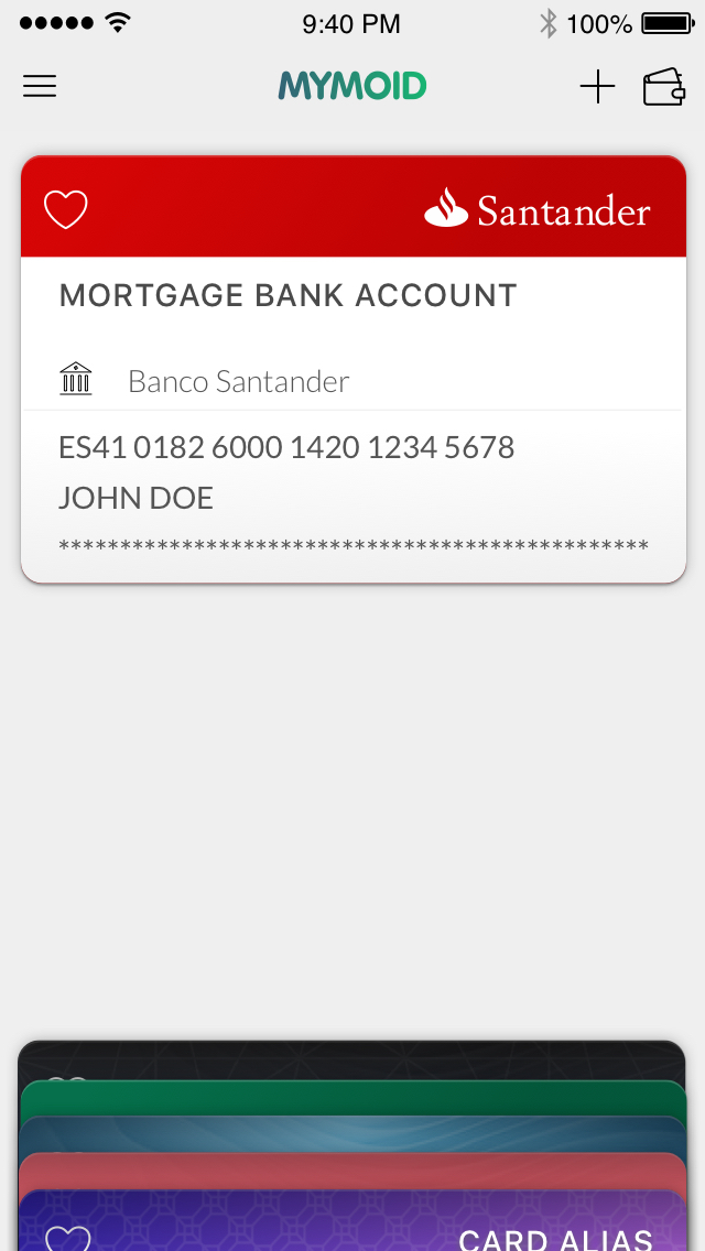
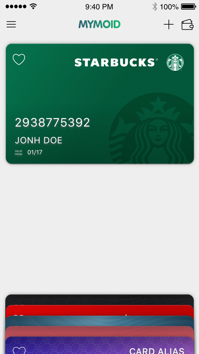
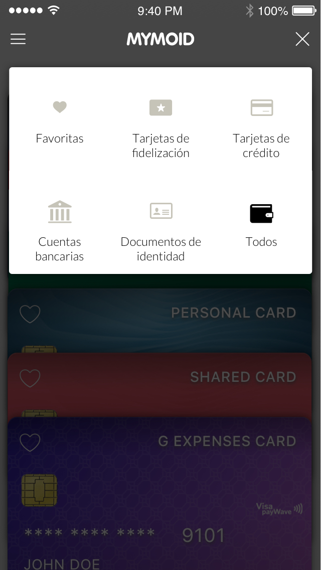
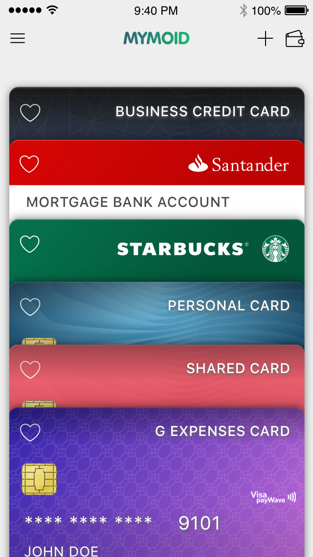
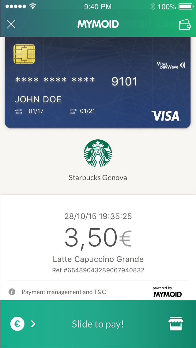
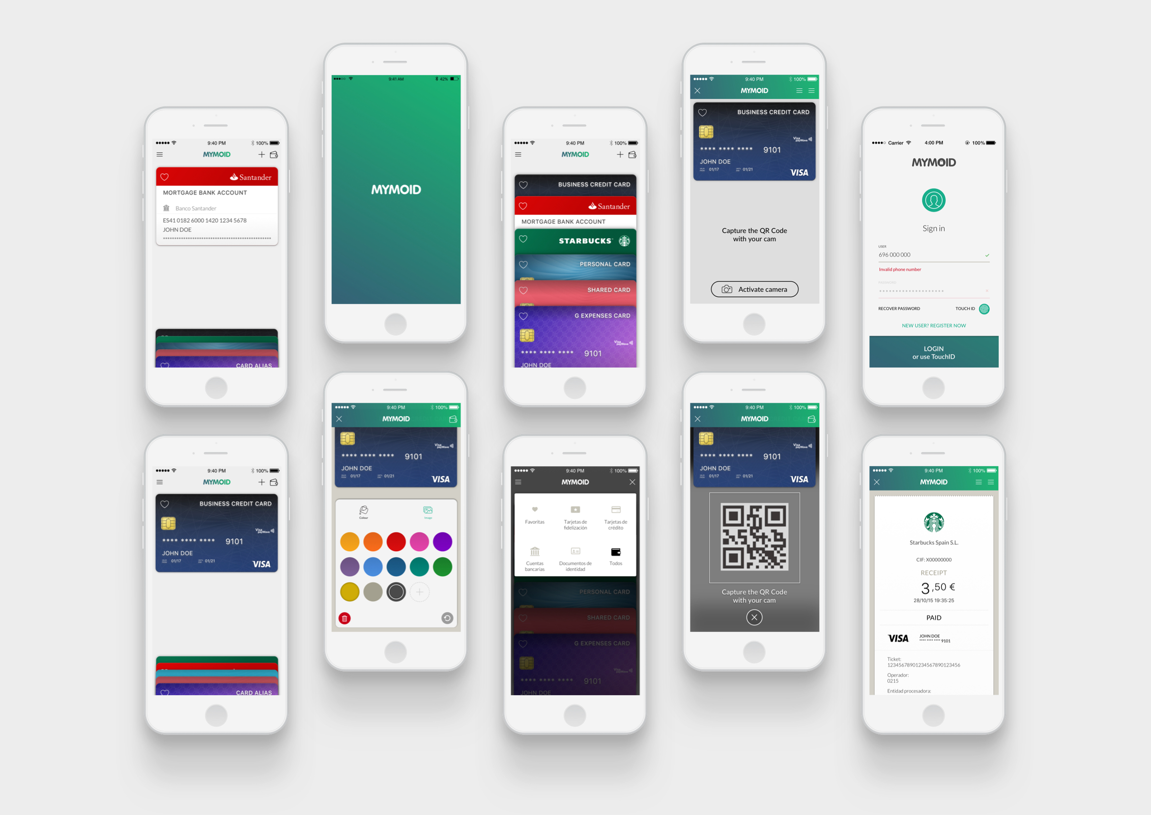
From this strategy, the final delivery would be a Wallet App capable of storing credit cards and making payments in a certain number of stores.
Previously TECHNOactivity had released a first version that didn’t find a place in the market, but it was useless to comply with Correos’ needs. That was a base for a 2.0 more ambitious product designed and developed from scratch.
Planning
Problems
From the beginning the project execution was conceived in a stretch schedule. We had just 3 months to deliver a first working beta version that could be implemented both by merchants and partners. The decision of creating a product from scratch pushed us to asume many risks, so we needed to work from a lean approach and gain detail during the rest of the develop stages.
Besides, the team was minimum. The company had face a employees shortage during the previous years and the profiles were really short –I was the only designer, facing a complete UX design project, that was challenging but also exhausting.
And for three the complete project would be split in several products: user wallet app and merchant ePOS app (both on iOS and Android), merchant web-based dashboard and executive merchant group reporting dashboard.
In the end, we needed to struggle with many limitations to create some reliable products in a really short term. We needed to work hard and also accurately.
Solving
Solutions
Being the only designer in a complex SaaS project is exciting but faced lots of additional requirements. First defining meticulously every single step of your tasks. Secondly making right and many times brave decisions about priorities and commits. Thirdly relying –and being reliable– on a team, horizontally, sometimes as a leader and sometimes as a sidekick.
Aside from the user centred approach that wasn’t argued, the point was to shorten as much as possible the decision making process, easing the way to developers and staying proactive. That involved negotiations and individual goals sacrifices –the product wouldn’t be as perfect as expected and many key aspects would be polished in later versions.
With no time to work with real users, research would rely on the previous strategy and on an internal benchmark. In exchange, I assumed a role in the functional definitions, so that the UX focus would be present from the beginning and the decisions were made at once. For now methodology wasn’t going to be applied.
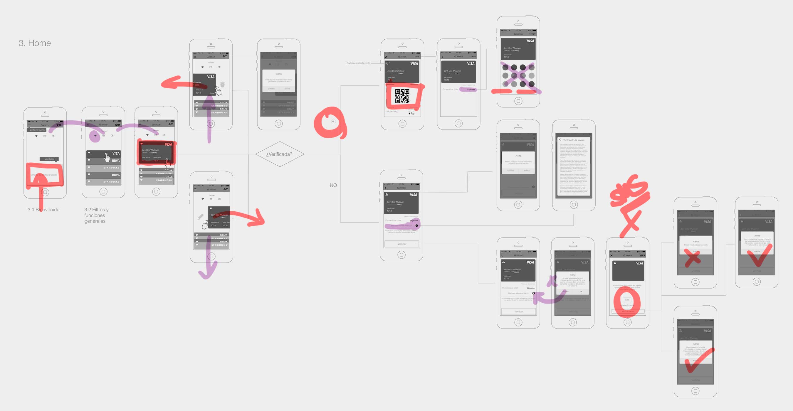
After an initial wireframe sketch and flow diagrams design, the most difficult part of it was to come.
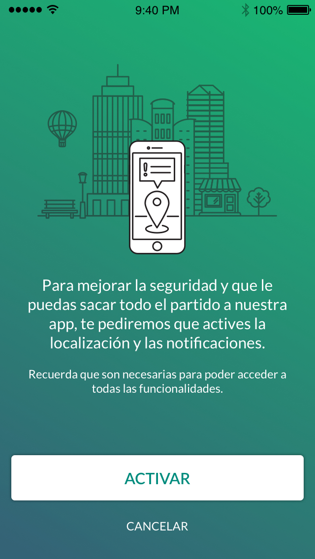
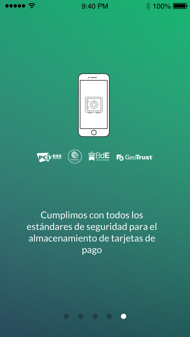
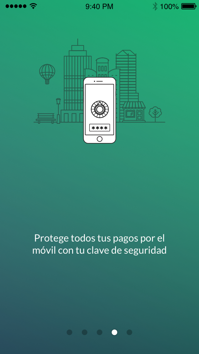
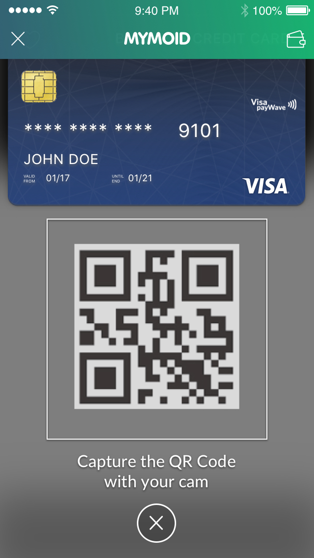
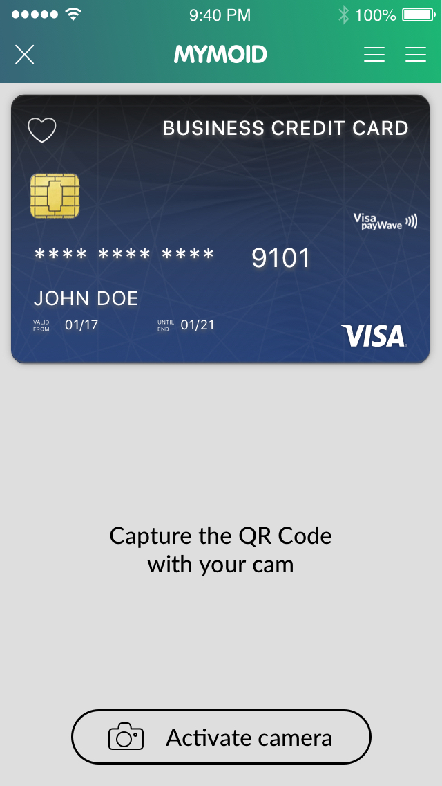
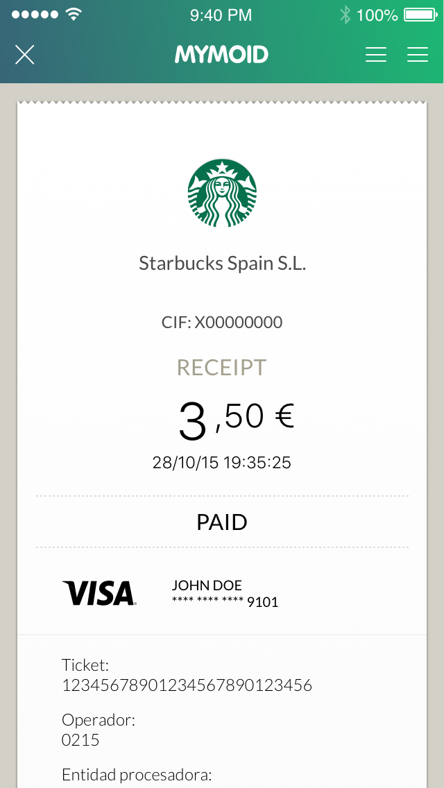
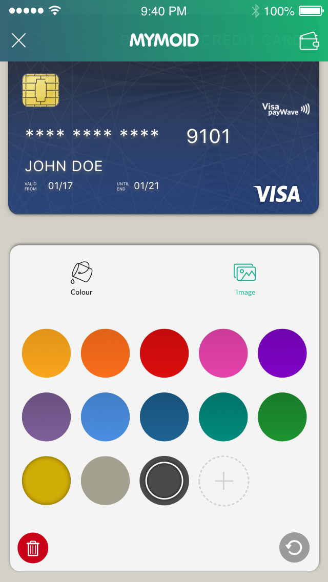
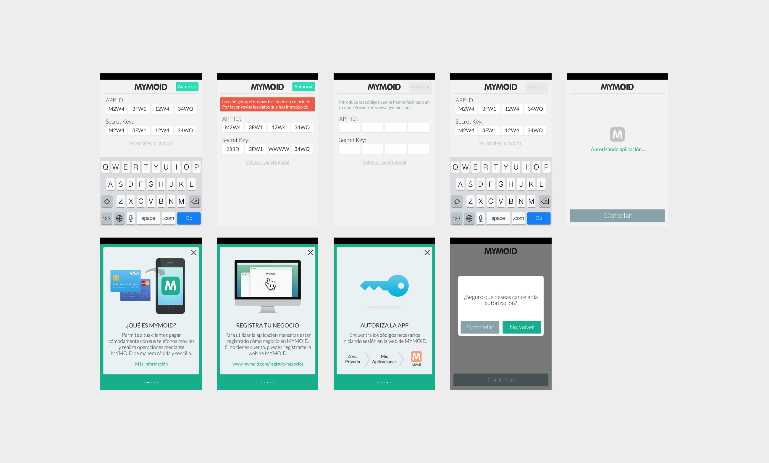
Designing four complete apps –two apps on two OS– would have taken a long time. The decision was to create a solid but wide design framework that could be useful on iOS and Android, with enough common elements for the merchant and user apps. Based on a primitive atomic design principle, we described appearance and interaction for global styles, form components, lists and the main proprietary organisms such as credit cards, receipts and status screens. That would leave us enough time to describe in detail some others UX flows, sounds, messages and secondary guidelines (illustration, performance and interaction design).
After dealing with that solution, my work was more lead to supporting and supervision, polishing some visual aspects and evaluating the releases.
Creating
Performance
As noted above, in a couple of weeks we created a complete uncluttered framework that fitted the most of the UX design flows needs. The framework was delivered as a set of styles, components, icons, components and interaction descriptions that could be used for the frontend developers on any OS.
Aside from that, some other interactions were tailored to our purposes on each operating system. Some elements couldn’t be created the same way (we had may problems with card views, i.e.) and alerts and notifications had different behaviours depending on proprietary GUIs. That wasn’t a big deal in the end, but it was an extra effort we needed to assume.
On the other side, we encountered technical hurdles from the functional definitions. The platform was quite limited to the new features we described from UX design and we had to put up with some provisional solutions while we explored an update.
And finally the harder part of my work was to find a balance between my expectations on the final product and reality, leaving painfully some of the main features for future roadmaps and trying to create a balanced comprehensive overall result in each and every product.
Work was quite dynamic. The design grew in details as we iterated and results were visible in a couple of months. We had a MVP three months later, that only needed few fixes to make it acceptable. Visual improvements were going to be made later, as the alpha and beta phases evolved and we could get a feedback from stakeholders and users.
As for they would work together both merchant and user app needed to be developed at the same time, which meant a tough coordination effort. Payments and refunds would coincidence in time, so if we wanted to test results and deliver features, work was double.
After the design phase, I was committed to the testing and QA tasks. We lacked of proper testing tools so we needed to solve it manually, supervise fixes, set priorities and iterate with the development team new specs. That process was long and tedious, but helped us to improve the products and to create a more accurate roadmap for future features.
Delivering
Results
In three months we had created a MVP that helped to gain the partners and stakeholders confidence on us. It still had lots of bugs and lousy spots, but the results were good enough.
And although the project was abandoned by Correos in the end, we could release some products that helped us to move ahead on our company strategy, adding more products to our company portfolio and widening our platform and experience.
As a personal success I caught experiences working as a for one UX design department, dealing with Agile and Lean methodologies and facing a complex and stretch project. The effort was enormous but I got a lot in exchange.
