Media Markt Spain
Year
2015
Deliverables
- UX Consultancy
- Mobile App UX-UI Design
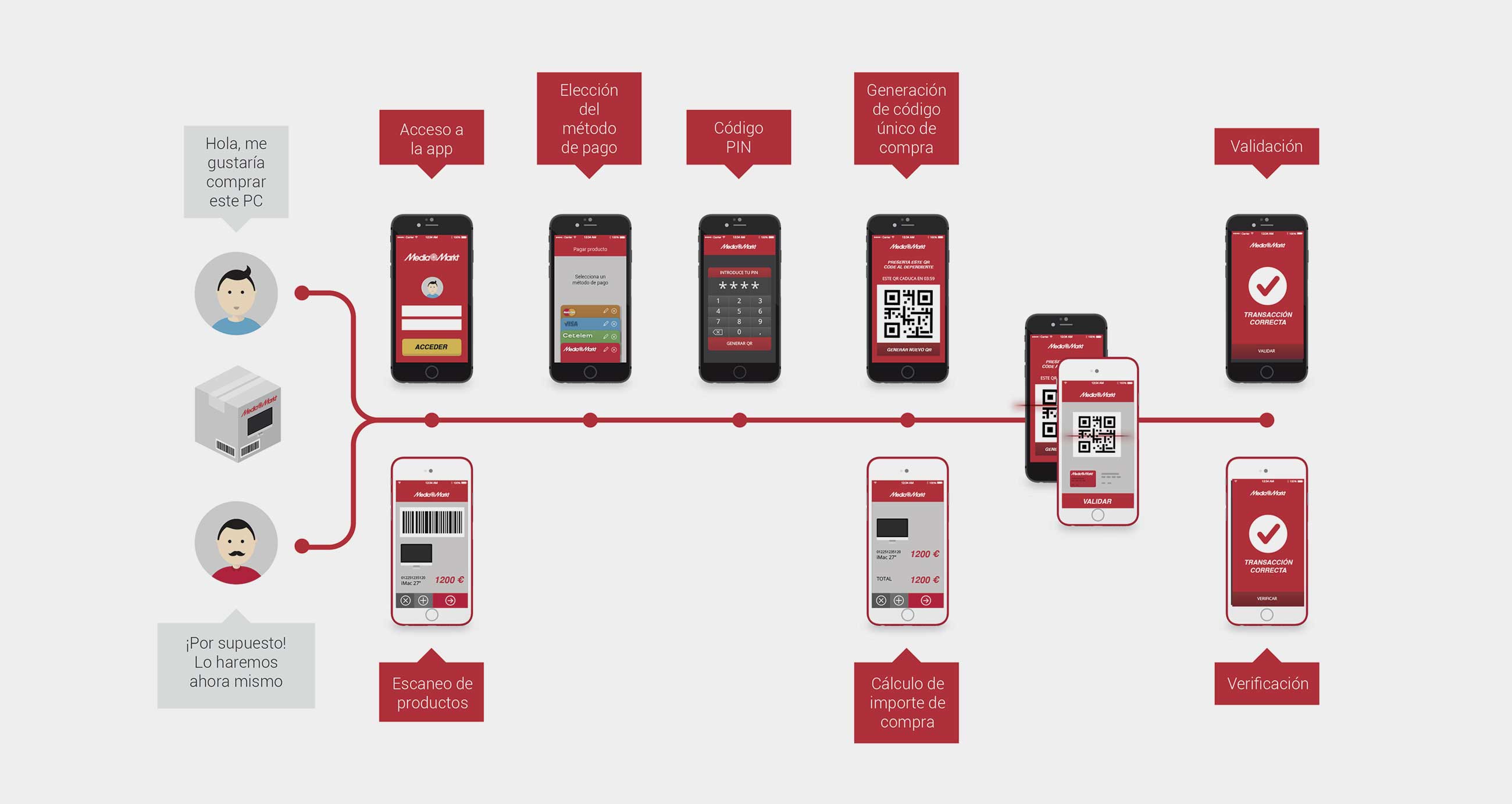
Accepting payments made easier and faster through mobile phones
Come. Choose your product. Pick it up. Pay. Then go.
Media Markt wantend to change the users purchase their product in a seamless and transparent way. Why wating for queues? Why going through a till? Why using a cash machine when the assistants can be wherever the selling decision is?
Come. Choose your product. Pay. Pick it up. Then go.
No wallets. No physical credit cards. Just phones. Welcome to the future.
Challenges
Let’s create a new model for paying and cashing just with your phone at a large store
Section No. 1
Approach
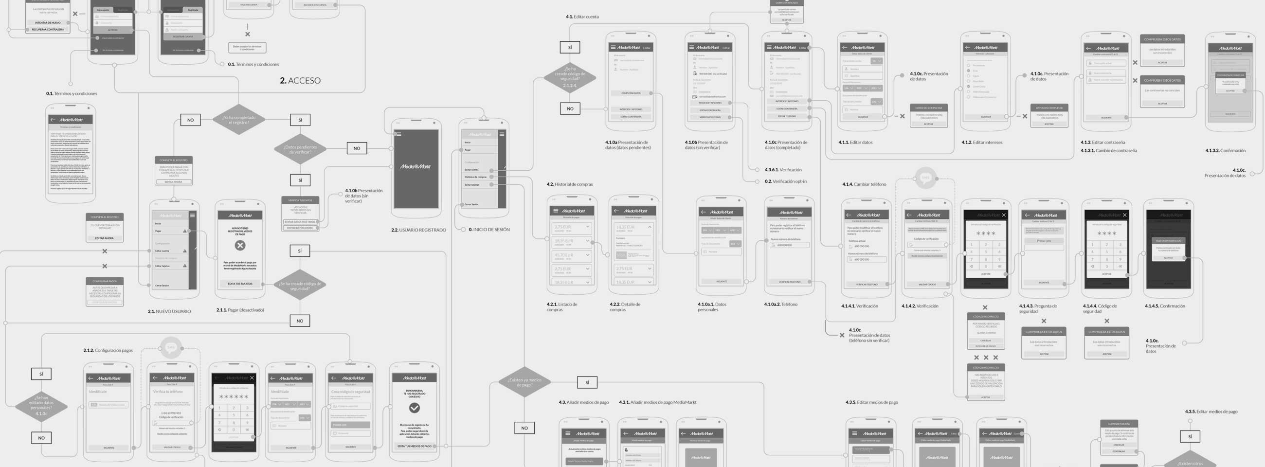
MYMOID mobile payment system had been developed time ago. The main part relied on the customer’s phone which was allowed to pay from their device at any moment through the QR Code printed on the receipt. But Media Markt wanted to take control over the payment moment, due to possible incompatibilities or lack of signal at the tills. Besides, their actual flow was less customer dependant and the transaction had to be done in two levels –at the CRM which controlled cash and at the payment method. So the original flow had to be redefine to fit Media Market requirements but keeping at least the main from our UX approach.
In this new flow we needed to rethink the payment moment. Our customer needed a lot of fixes from MYMOID’s standard flow, due to its culture, organisation and the huge effort required to change devices and education at work. As a preliminary request they suggest to alter our user empowered focus –in which all the steps are made by the user: payment method selection, payment order capture and payment approval– to a less flexible solution.
On the other side, the app should work standalone, connected to devices, CRM apps and data bases, letting the assistants to change their location and tasks at the store. In those cases there were security concerns, such as operating devices thefts and poor connectivity issues.
A first research helped to understand that the main project wasn’t just to redefine the collecting experience on the customer’s side, but but also on the assistant side. And both sides needed to be connected to a broader environment: payment methods and CRM. Then user stories definitions started to multiply.
Section No. 1
Problems
In this new flow we needed to rethink the payment moment. The customer needed much more interaction with the till assistant than observed initially. In the original MYMOID payment process the customer and the merchant could be totally disconnected and the momentum relied on the customer’s actions. The payment could be delayed as long as needed. However, in Media Markt model the interaction wasn’t just between a user and an app, but also between the two users at a time, interchanging information and completing tasks.
Additionally this process needed to be agile and quick, otherwise it would take too long to complete it and that’s a serious hurdle when managing a till.
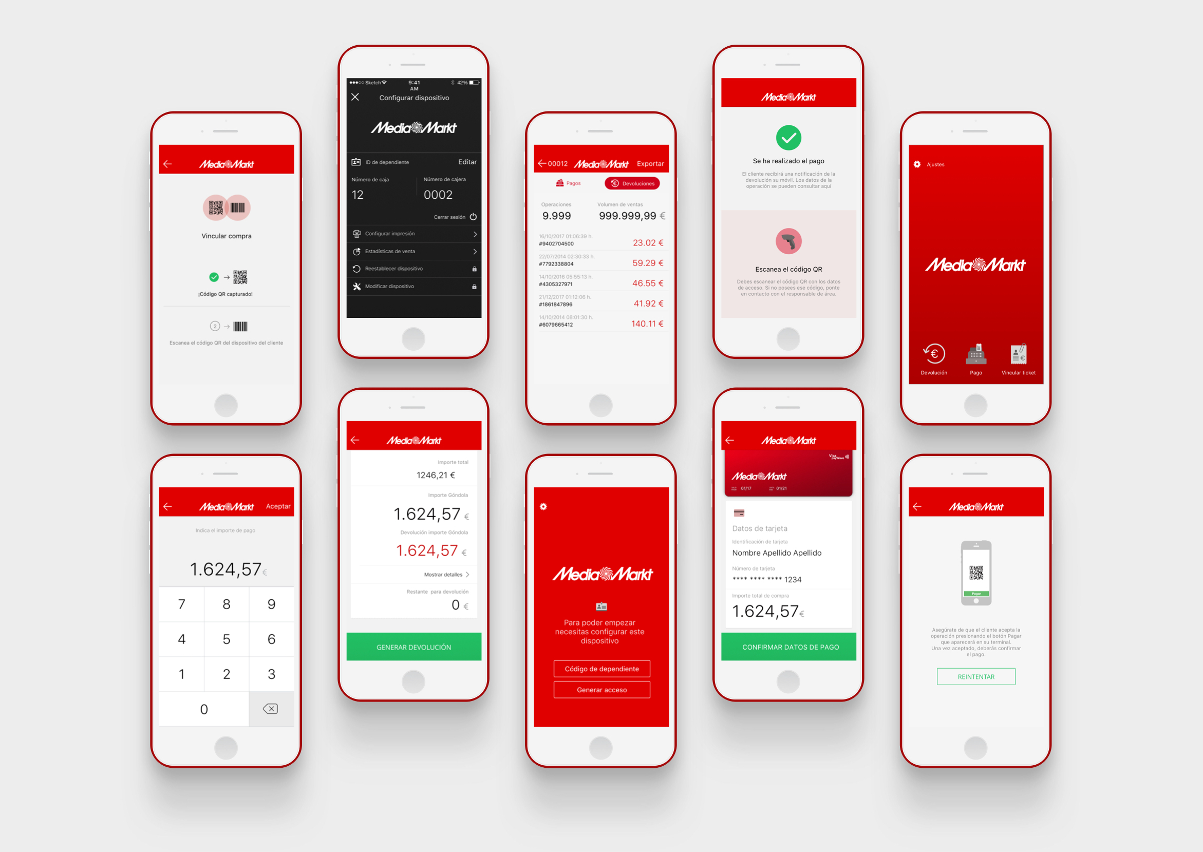
And besides, the till assistant won’t only use the app to initiate the purchase and complete the payment, but also they would need to register the receipt all along with the cash.
Section No. 1
Solutions
The device was the key in such complexity. We detected that the user and the till assistant would need to be perfectly coordinate, so we helped both to monitor their movements one with the other.
We defined the whole thing from above as a single flow: how will the payments work? How would they connect to the CRM server? But once we started defining the UX we needed to work on both flows separately. The system needed to follow some key steps, so our first effort was to fit them all together.
We had to make decisions about many details that hadn’t been defined previously when the project was kicked off: backend configurations, CRM integrations, operations latency, security issues and peripheral devices connectivity.
We divided use cases in three main groups that affected the UX in a different way:
- Purchase preparations, in which the customer would decide the payment method and the merchant would register the check out
- Purchase action, in which the user and the merchant would need to interact between them and individually in a validation process
- Purchase registering, in which the merchant would need to add a receipt to the purchase and the user would receive the purchase confirmation for support
The devices set up and maintenance were also important but it was more related to a business concern than to a UX issue. So although we also worked on it as a side use case (multi-user feature and activity registration) we relied it on the backend and selling side.
Section No. 1
Performance
The UX was defined from our MYMOID experience. Aside from some aesthetic polishing, the idea was to simplify as much as possible the flow, making the process understandable and predictable. Although we learnt a lot from previous projects at MYMOID, this approach was more complex –managing receipts, linking bills and dealing with the customer’s device.
On one side, there should be clearly described steps showing of on their device’s screen. We set the process as a dialogue between the machine and the user so that the assistant could know what to do at every moment –we asumed that despite the training there were going to be too many details to pay attention at during the payment.
On the other side, the UI needed to be water-clear and easy to understand. In fact there were few new functions, but the process was long and annoying, and any mistake would imply starting over again from the beginning. Clear messages, clear iconography and clear steps.
Whenever the customer’s app was intended to be attractive, the merchant’s needed to be neat and functional, so we proposed clear and aseptic texts, plain colours, large buttons and direct instructions.
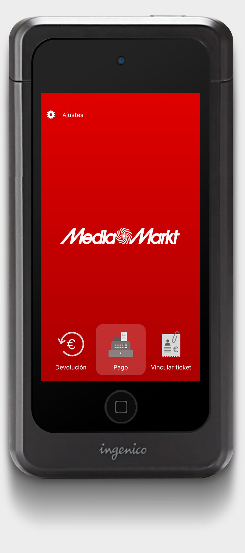
On the other side, even when the device was a weight light and thin iPod 5G, the POS case made it heavy and difficult to hold. We tried to visualise the scenario to make easy to tap buttons and to add evident behaviours.
And finally, we tried to keep the flow as short as we could, reducing the delays and effects by making them short and descriptive -brief animations, direct control and anticipation.
The UI was simple –yet balanced and elegant, as much related to a POS terminal as the brand guidelines let us design it.
Section No. 1
Results
In the end the result was a sleek, efficient and simple app, just the way we wanted it to be –except for some inevitable development limitations.
The main success was to translate our UX to the merchant’s app, integrate the customer’s app to our flow and convert it all in a complete payment process. Although the actual revenues are still to be known (it’s still a pilot program) the main success was to create a new cashing model, mobile centred and functional that helped to make a step forward at customer experience.


