Lastminute Group
Year
2018-19
Deliverables
- UX-UI Design
Helping the user to discover their perfect holidays easily and consistently.
Mobile is everywhere, so the chance to figure out where to go for holidays. But it required a lot of optimization to make the discovery process mobile friendly –efficient, smooth, responsive and comprehensive with the current user journey
Challenges
Let’s improve the findability in dynamic packages to help the user to find the best choice.
Background
Mobile usage on the main web page wasn’t splendid. Despite the effort done in the last previous years by the company, the conversion rate at the end of the funnel was residual compared to the continuous growth of online purchases. According to the regular amount of visits from the homepage, the numbers would be stable in lower than 5% rates, much less if we considered those who made it to the end of the funnel. Although the perspective hasn’t been that good, the silver linings were an incredible margin of improvement and the opportunity to create a consistent multichannel experience.
Planning
Approach
After some analysis from the Product Owner, stakeholders and UX Research team, we found a list of major touch points and pains for the user:
- Result card. Especially on mobile, the current hotel info card layout occupied the whole screen. Moreover, on small screen devices, it over-flooded the screen height, so it was quite confusing to scroll through the result list. We believed that by offering only the key information we would be able to compress the card component enough to let the user see up to 3 cards at the same time, so scrolling would be clearly optimized
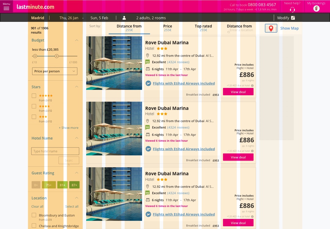
- Filters. Sometimes the list of results could be overwhelming. Some users may find it a positive point, but in the end, we didn’t want the user to spend a lot of time making decisions. Results needed to be refreshed from time to time and also on mobile it was difficult to scroll through so many items. We needed to encourage the user to use filters effectively, make them predictable and clear, and avoid no result use cases. Since that had been specifically reported by stakeholders, we needed to solve that urgently
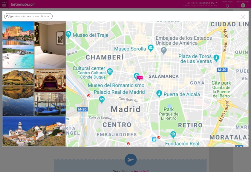
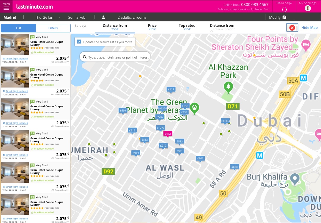
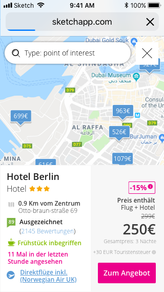
- Maps. As part of the hypothesis, we assumed that the user would prefer to make a decision based on location. So far we were offering the hotel’s address but, assuming the user wouldn’t be able to locate the place accurately, we needed to pin it on a map. Our concern was how many of our users would start searching based on locations or on hotel information
Pain points
- Performance limitations. Which mainly impacted on maps. As a restriction from tech team and business management, we needed to cut the usage of maps. We needed first to decide when to show it, and then how to use it in an efficient way. The map needed to be a discovery tool, not just a complementary component
- Lack of content optimization. Which affected to the amount of information we were placing on the cards. This led to a tough work of deciding what to remove from it without affecting the many corner cases we were likely to face
- Refining search and exploration: awareness. Using filters was a pain. On desktop, the performance problems would block results reload. On mobile, the filters were hidden, so the user needed to display them to change their criteria
Solving
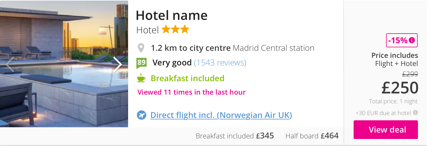
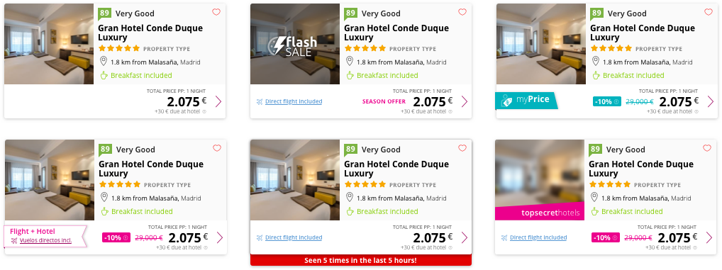
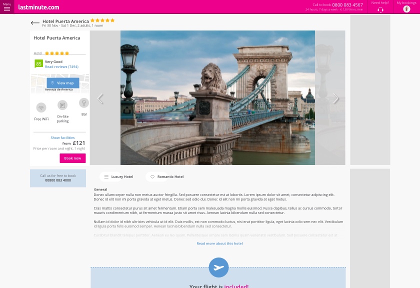
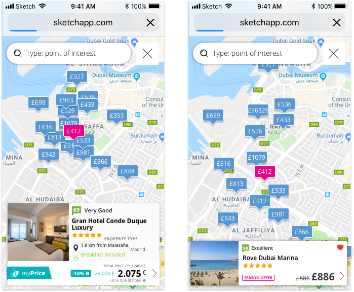
Result card: going slim
The result card is the key pattern at any hotel website. It contents all the information a user needs to make a purchase decision but also it’s part of the DNA of the business –most of the competitors´ result cards may be alike but they have some particularity based on the business, provider, offer or user.
Coming from an exhaustive benchmark performed by the UX research team, we detected that many of our main competitors had been developing different solutions: it was a growing demand from users. We needed to move fast. At some point, they were keeping most of the information available from desktop versions. So it happened on Booking.com, ie. And that was the approach that had been applied by then at Lastminute.
But responsiveness is not enough. If we expected the user to adopt a different use of this component, we needed to offer a really different component.
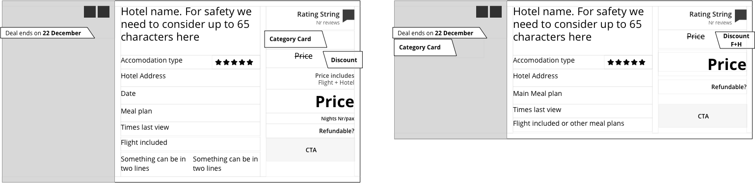
Artwork of previous desktop result card
Artwork of previous mobile result card
Revising AI.
What’s important to the user? Maybe the picture, the final price, a special promotion? What’s the value from the business?
The picture and price were the first noticeable information. But some other features like included meals and urgency alerts were proved to be decision triggers.
So we listed all the content and features, prioritized the value to the user and tried to get rid of all the redundant content. Finally, we produced a first draft that prioritized impact over content, trying to keep it as brief as possible.
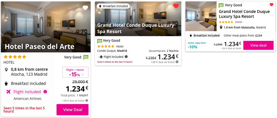
The result was this:
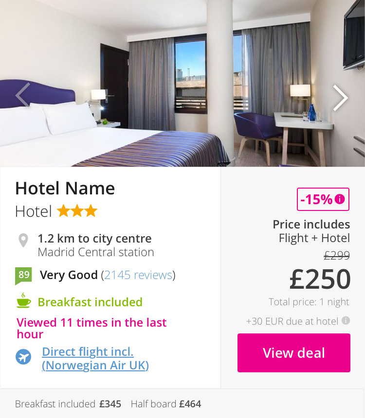
Designing.
The design process was tough. All the possible corner cases started emerging while we were adjusting the final design. We need to figure out how to limit the room to each of them to convey the user’s expectations and also summarize all business requests.
Final draft and interactions.
After several iterations and internal testing, the refinement was led to cover most of the use cases, harmonizing styles with the rest of the design system and adapting the needs to languages and promotions. Thanks to the previous ideation work, the result was easy to implement
Filters: results à la carte
Previously and in parallel to the result cart refinement, we had to face some filters’ improvement.
Until the time I joined the project there had been a lot of changes related to filters. Traditionally, the search task had been constantly constrained by many categories and labels, which made the search itself a bit more difficult than retrieving results. Besides, some technical issues made the search a real pain when using filters.
On both, desktop and mobile media, we needed to unify solutions in order to:
- Reduce the amount of No result pages that forced a new page to reload and thus a new search from the user
- Communicate consistently the expected results to the user, to make it more predictable and useful
- Let the user activate and deactivate many filters in a short lapse of time without blocking the result list
- On mobile –and later on desktop–, let the user see the results of the filters and remove them from the result list
According to these requirements, we prioritized mobile over desktop but kept an eye on the improvements and the learning.
Expected filter results.
As it was conceived previously, the user rarely could have an idea of the results returned at the card list. This blind situation used to carry the user to an annoying not found status, but it wouldn’t inform the user what was the filter combination.
Moreover, on mobile it was necessary to switch between list view and filter view, which made even more difficult to understand how it worked.
Our first move was to inform about the expected results related to that filter:
Before and after adding expected results to filters
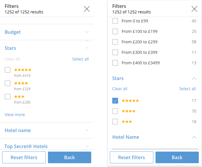
Basically, we moved the concept filter to the concept facet. That would also help to solve the same issue at the desktop view, in which this issue was more complex.
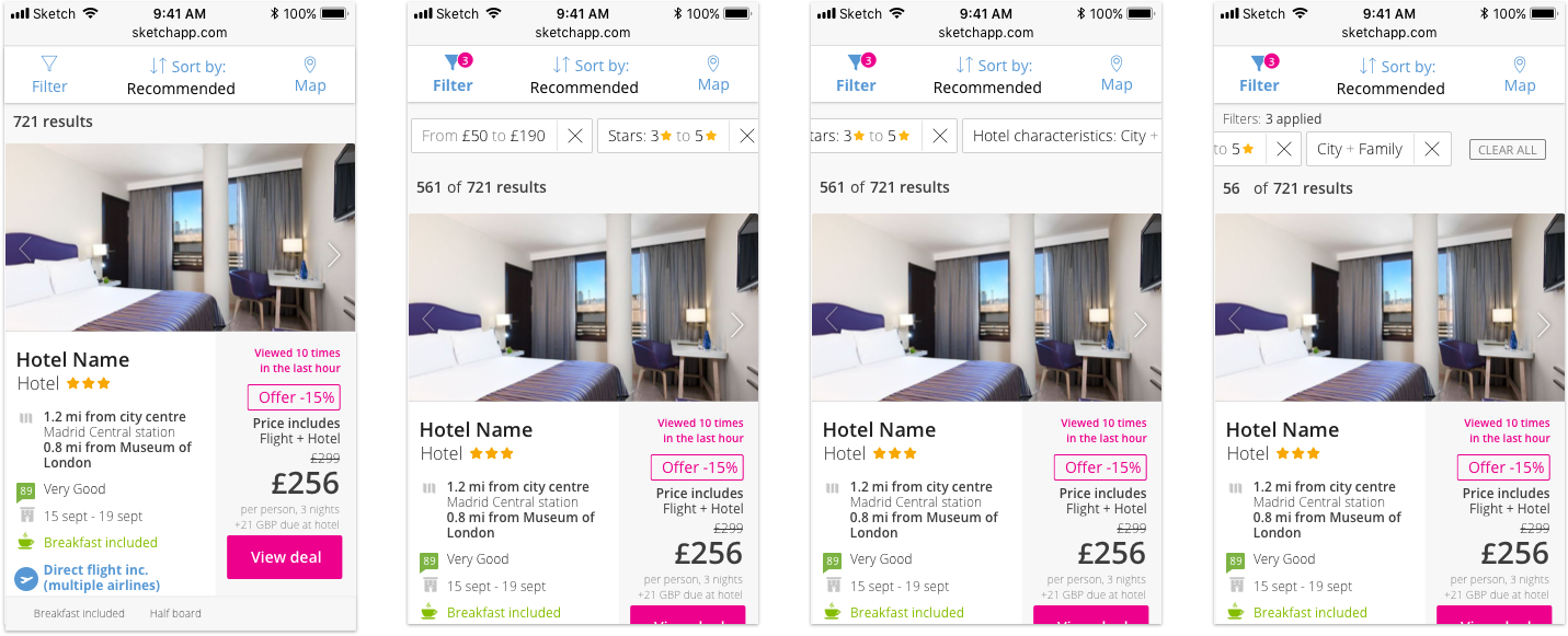
Filter bubbles.
Switching filter to list views had been a recent improvement, but it was still a bit lousy. Even when the user could see the expected results, switching it back needed a lot of interaction and we were dealing with a lot of friction.
As an additional effort, we decided to let the user see all the choices taken from the filters list and confirm or remove those that wouldn’t prefer after checking the results. We created the filter bubble component to inform the user.
Our first move was to inform about the expected results related to that filter:
Filter bubbles process and navigation
Final draft and interactions.
Additionally, to the improvements above, there were offered some other minor improvements to prevent the filters to block the result list and to stick the filter interaction on the list reload. In the end, the overall result was also applied to the desktop screen designs.
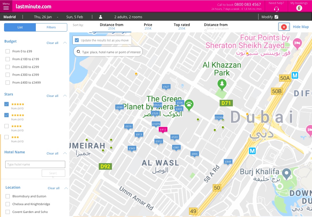
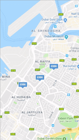
Maps: you are here
Map utility had been a major feature during a former redesign and the new design system release a few years ago –I hadn’t joined the company by then, but the conversation was still alive. The result had been successful for a long time.
However, some internal decisions, performance restrictions and stakeholders’ insight made the priority emerge again. The map hadn’t been questioned but it was necessary to make it appear on demand.
UX research insight spread light on the component through benchmarks and user interviews, and the conclusions convinced us to give the map an important position on the user’s search habit. Also, tracking the map interactions had shown that the users really used it. Even when CR was not related to the usage (the user would navigate whether they used it or not), the map captured a lot of interactions. The hypothesis we proposed was vague but all in all, we discovered that the map was a feature with a dubious affordance –something that may not help directly but we couldn’t get rid of anyway.
We decided to make bold changes:
- Cut the usage of the map, just when it was necessary: the user needed to invoke it, to avoid it by working on the background. That meant also gaining some space for the rest of the layout. This seemed to work okay for some competitors: Booking.com didn’t display the map, Airbnb was placing a switch to toggle it… We were among the few that still let the user navigate without performing any interaction, but we didn’t have a reward for it
- Placing the map as a powerful information asset for detail pages, making it come up from below the fold and making it easier to find. One the user switched it on, it had to have a clear purpose
- Improving searches and navigation within the map component. So far, the map had been a list companion. Since map and list were now meant to be independent views –especially on mobile–, we needed to make it useful also as a navigation environment
This required a lot of work to progressively tackle changes, AB tests and improvements. The process took several weeks, and it lasted long after my leave, but an important part of the work was already complete.
Placement and functionality.
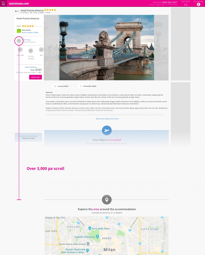
Changing the interaction implied redesigning many other components. Until then the map had been filled an important proportion of the layout, activating and deactivating it would change the overall UX.
At the hotel detail page that was easy. The map had been far below the fold, linked to a shortcut close to the hotel main information. We just removed the map from there and displayed the map full screen when triggering the button.
Original detail page and scrolling to get to the map
New map toggle and fullscreen mode
Although the risk was low, these changes got a supportive result at the AB test. The usage boosted up to 50%, and although it didn’t bring the same success to CR, we learned that we take advantage of it in the future if we figured out how.
Anyway on the result page, it wasn’t that easy. Removing the map component pushed us to redesign the whole layout. It helped to keep the user far from cognitive load and distraction, but we needed to face a new drastic change.
The grid was then readapted with minimum changes –fast delivering to test at low cost. By the time I still proposed the solution, the new layout was on study.
New map toggle and fullscreen mode
This proposal leads to a new perspective on the result page layout. I’m not going to credit for the amazing job that my replacement there did after me. I guess that a lot of decisions needed to be made and probably the details drifted all along with the conversations and AB test results. But I’m proud to see that the core gist of the latest proposal still remains.
As an incremental, I still had the chance to evolve the latest idea of keeping both card list and filters pattern cohabiting with the map:
Last sketch: allowing the user to interact with the original components and the map at the same time
Mobile approach.
On mobile, the full screen map already existed. The reasons are obvious –splitting the layout was impossible.
Anyway, we still wanted to improve the UX on the map.
The main friction, as it happened for filters, was that switching between the map and the result list wasn’t perfect. Furthermore, at that moment the only way to display the hotel information on the map relied on the original mobile card, which covered most of the map, and blocked the chance of interacting with it.
Original design for detail card on map
The evolution took advantage of the learning of slim cards –yes, here also the component would be key. But still, it may be too crowded if we wanted to make it work under some circumstances.
The main improvement for this incremental was to provide the map with all the navigation features from the result list, letting the user select the hotel seamlessly from the map (prioritizing location over information) and checking key information to make the choice. From these cards, the user also would be able to proceed to the detail page, so the goal was involving the map in the CR improvement so that the 50% usage increase that we had detected would be now on our side.
Before leaving, this plan was in review. But accordingly with the current layout, it has been developed, tested and implemented in the production:
Design incrementals for mobile map detail cards
Interaction to navigate through details card

Further actions
As a longer-term step of the project, the detail page had to be redesigned to cover many of these changes. Although the structure was going to be revamped (my leave was before starting the UI redesign, but many of my UX discoveries were applied later), we prioritized and executed some first improvements:
- Hotel detail gallery. UX research team reported that one of the main features for the user’s decision was visual references. Actually, according to heat maps and screen recording reports, 2 out of 3 users would navigate
- Detail page map. The map usage was a mystery on the detail page. The click rate was low, but also its position under the fold. Also, it was placed in a frame with the precise location, so the utility wasn’t clear
- Information Architecture and navigation. The gallery covered most of the fold, whilst the room details and price options were placed after a long scroll. More than 40% of the users wouldn’t reach room details
- Storing favorites. As part of the effort to let the UX go multichannel, we proposed to let the user pick choices among the results in order to complete the selection later and complete the funnel from there
Results
Since the redesign had been split into several tasks, it wasn’t clear how much impact each of them had on the overall process. Considering the AB test results, most of them would not affect negatively the CR, but have positive feedback on every simple task the user would perform.
The best result came from the most ambitious change. The slim card pattern returned an important CR increase (results to detail page, although I’m not allowed to disclose the actual rate) on mobile, which would improve slightly the payment opportunity of converting to the checkout page from here. Not bad as a start.
As a critique, this success needed to be studied closely since it may be caused by the exploration itself. Wiping some information from the slim cards would have pushed the user to navigate back and forth between results and detail pages to complete the lack of details. Pictures had been resized and special conditions were not visible anymore. The only way to confirm that this redesign had been a complete success was to check further changes and metrics in the following months and see how experiments worked on this basis.
The rest of the experiments were tagged as inconclusive but would respond to an overall improvement of performance and business interests, and for now the increase has stayed stable.
2.5
Overal CR
12
CR
1.2
Estimated revenue